Showing posts with label Copies/Scans. Show all posts

Sunday, 10 April 2011

Types of shots used - Opening shot


When designing the story board for our Opening Sequence, I decided to include a close up, low angled shot of the girls feet because it was interesting and different. Instead of opening with an establishing shot, I thought this would be more effective in the respect of meeting the requirements of the genre of what the film would be, because this shot conveys a sense of mystery as it doesn't show the characters face, only feet. I decided 'Abbie' (primary character) should be bare footed to further show her drunken state which would explain how she thoughtlessly invites what could potentially (and ironically is) a murderer. I also thought this would make her stand out against the two with their shoes still on. Following this the camera zooms out to allow more focus and understanding of the surroundings for the audience.

Thursday, 7 April 2011

Completed - Production Ident

Today me and Maisie completed keying out the green screen from our 'floating hand' for our Production identification. My initial idea was for it to appear as a gypsy/ physic/ medium type thing, mystical and magical. To do this I filmed Maisie's (starting in the shape of a shell) gradually opening whilst turning round infront of a green screen (very hard to find brightest light for best quality!). My aim was to once finished chroma keying, was to design and create a background (night sky with stars) on photoshop and import this into the moving image on final cut express along with another still of the crystal ball which would appear gradually as the hand revealed it. This turned out to be a months long project and was therefore unsuitable so instead we decided to have the globe appear after the hand had finished its 180degree turn. This was highly more convenient and do-able. I decorated Maisie's fingers in rings because that is how I imagined a readers hand would be like from stereotypes I had previously seen on TV, (probably from watching to many Disney films). Creating this probably took more time than the opening sequence itself! We had to search for the stars on the internet, download them, convert them, then import them. We used the colour gradient tool on photoshop to make the blue background seem more realistic (lighter towards the bottom because of street lights and so on from residential areas below.) As for the globe, we spent hours trying to make it look 3D not just a solid colour, so we fiddled with the inner and outer glow buttons untill we were satsified! To finish it off I wanted a twinkle, magic, 'fairy' sound to play as the hand moves, we found this on youtube and changed it into a MP3 file them dragged it into Final cut express. Final product looked reasonably good, but not how I originally hoped. Below is a print screen of the Production Ident.


Wednesday, 6 April 2011

Guides - Conventions of Sequences

This diagram, that our class teacher gave us, I have found very useful when putting together our Opening Sequence as it contains information you need to create a standard opening sequence and displays this in an attractive, fun and easy to read way. I use it as a referral to check every now and then that our Opening Sequence fits the criteria of a published, successful and earning one.

In the making - Production Identification


The above scan shows the rough sketch I drew of the routine/ pattern I intended the 'Bouncing Ball' to follow during our Title Sequence. We are using a programme called Adobe Flash to create this. I believe the introduction to the film production company is a vital competitor present in Opening Sequences, as a good one of these at the beginning of any film immediately intrigues its audience therefore encouraging them to watch on. Although the Title Sequence we create may not be of the high standards that for example 'Universal Studios' or 'Warner Bros.' possesses however it will be to the best of our ability!

Group Meeting - General

Below are a few notes I wrote down to help initiate and prompt me on the points I wished to bring up in the discussion.


Friday, 28 January 2011

Copy of - The script

This is the script I prepared a few days prior to filming, for both the actors (to learn dialogue in advance) and the Camera crew/ Director (for other purposes such as knowing where to be, where to shoot from and where to expect the actors to appear from) to use when rehearsing and filming our Opening Sequence.


Thursday, 6 January 2011

Where it all begun - Story Boards


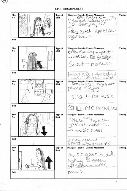
Above is a copy of the story board I created over the christmas holidays. I didn't include the type of shot because I think its obvious what time of shot it is from my sketches :) nor did I specify the time of each shot because this was really just a rough copy and I wasn't sure how long each would be. Plus I knew there would be lot's of changed made to it.

Monday, 3 January 2011

Researching into - Genre + Audience

Below is a tally chart I created to explore into different age groups, finding out what their favourite genre for film is. I asked 40 people from each age group and these are the results I got:


As you can see from the chart, Horror was popular with all age groups but teens and under 25's in particular. Therefore I decided the Opening Sequence story board I was to design would be of this genre, targeting 16-25 year old's as my audience, I thought this wouldn't be to difficult seeing as I am in that category so I would just ask friends of a similar age what they thought as well as creating something I myself would enjoy.

Thursday, 25 November 2010

Children Of Men - Mindmap


This is the mind map I created whilst watching the opening of 'Children Of Men' to assist me with my essay.

Monday, 1 November 2010

Planning - Drawing of horror still


We were asked to design a horror still for practice with creating the correct mise-en-scene as well as using the cameras. Above are the sketches I produced, portraying the ideas I had.

Monday, 25 October 2010

Representations work - Secret and Lies

The clip opens with an establishing shot of “Maurice Purley Photography” (shop) with cars passing by, accompanied by music. The cars look old fashioned and dated which could represent the time in which it was set. Following this, is a medium long shot of a family of 4 including the grandmother, father, mother and son. Who we presume is the photographer, judging by his actions, appears in the shot for 14 seconds and then exits the frame however we can still hear his voice (off-screen diegetic sound). The costuming of the family suits both their age and gender, for example, the teenage boy is wearing a casual t-shirt and navy blue bottoms. In the background, there are no props apart from the newspaper which leaves with the photographer. There is also no scenery, just a backdrop for the photo which is made up of dark colours, smudged together to give a cloudy, muffled effect. The mother is in the centre of the frame, and appears to be the most important character. Body language of the father and son suggests he does not want to be there. Facial expressions of the mother and grandmother on the other hand shows they have probably organised/ planned the family photo. The lighting in this shot is low key, as the flash of the camera supplies the light. The sound is diegetic for the duration of the clip. Accents portray the family’s ethnic background (being British).    

In this clip there is only one individual however you can here the photographer. Judging by his costume (or lack of it), we presume he is a boxer. As far as make-up is concerned, it appears he has some means of this on his face and body to make him look wet and shiny as a boxer would be during or shortly after a fight. The body language almost contradicts itself as he is laughing with the photographer yet posing in a way to seem aggressive and strong, this is also shown through his facial expressions. The lighting in the clip reflects off his body adding to his ‘sweaty and toned’ appearance. The colours of the mans shorts and gloves, red, black and white, could be seen to represent the colours of the English flag as well as symbolising competitiveness. This clip shows a typical stereotype of someone involved in sport.    

The clip opens with the photographer questioning and conversing with the lady in the shot. She is dressed as a nurse in a blue and white dress with a white hat to match this. There is one prop present, an antique wooden chair. The women of orient decent, appears to be miserable, this is portrayed through her facial expressions as well as her body language seeming fake or put on. This is also stereotypical of working class people. The hair and make-up of the women is very minimal and ordinary. We assume from observing the mise-en-scene that she possibly represents a nurse during the Vietnam war which would explain her sad conveys.

 This clip is of a mother holding a fairly new born baby. The backdrop has now changed to a plain white screen and the mother is dressed in a simple white dress which creates a heaven like piece of imagery, the baby representing angelic innocence and purity as they are bare naked and celebrating the start of a new life and generation.

 
The final clip opens with five smartly dressed men, in suits and ties, representing their status, expertise and level of authority or importance. Four of the men are standing, while one man is sitting in a chair in the center of the frame. The slightly elder man who is seated is dressed in a three-piece suit, where as the others are wearing only suit jackets and trousers, this could suggest he is of a higher importance. The body language of the men makes them appear successful and professional this is because they are standing up straight which makes them look proud of what they have achieved as well as their happy facial expressions. The voice over is the photographer speaking and any other sound present is non-digetic. Again, the lighting is low key. The colour of the backdrop is dark, and the men’s suits are also dark which makes them blend in, however their white shirts and pale skin makes them stand out. The men in suits are stereotypical of working class English men, in the 1920’s.