Wednesday, 29 December 2010

Editing essay - Pillow Talk VS Fringe


FRINGE VS. PILLOW TALK
“How are the sequences from ‘Pillow Talk’ and ‘Fringe’ different? Discuss the differences in pace and style of editing as well as the effect the editing has on meaning/ the audiences reception of the extracts”.

Fringe and Pillow Talk are very different in terms of pace. Fringe, for example has a lot of cuts in the beginning of the extract that are quick. When the characters are conversing is when this is at its fastest, as little as a cut every few seconds. Whereas in Pillow Talk, there are no cuts in the first conversation, one cut in the second, and hardly any in the third. The difference in cutting is because Fringe is a more modernized film, but Pillow Talk is an old fashioned film and therefore is quite outdated when it comes to technology.
Styles of editing in the two clips again, don’t have much in common. Fringe demonstrates lots of fancy ways to move from one cut into the next, such as close ups at the start, showing reactions and facial expressions more clearly, as well as zooming, long shots and straight cuts. The camera is also always moving even if it is barely even noticeable. Pillow Talk, on the other hand has fewer examples of editing, consisting of only mid shots with no transition and long shots with a straight cut and then split screens. A small number of close ups is used, but they are present and the camera stays still throughout the whole extract. This portrays a general lack of education in editing.
Editing can have an effect on the audience reception of an extract. For example, Pillow Talks slow pace is likely to not appease a younger viewer. Or it may not appeal to those who like action due to not much happening on screen and type of genre and this could also cause the audience to perceive the film differently than the editors and directors intended it to be.
To conclude, although fringe and Pillow Talk have differences, they do share some similarities like they both use straight cuts (and vary on pace), and they both jump to the near future in each shot.


ELLA TRAINOR

Sunday, 28 November 2010

'Children of Men' Essay

Children of Men, released in 2006 and directed by Alfonso Cuarón shows our world very differently to how we know it. In the opening sequence, it is evidential that it is a futuristic film set in ‘2027’ by the use of repeated hints such as the voice over of the current news, the visual footage of the news and in case we miss that, text on the bottom of the screen displaying the date! This information is clearly vital to the understanding of the film.
The genre of the film being mystery and drama again is immediately portrayed, this time through the use of dark colours in the general setting, and other aspects of MES such as what we as an audience learn through the voiceover but mainly through the actual content of the opening sequence; for example the selection of what are meant to be ‘normal’ people are all dressed very similarly in dull and gloomy clothing, and the way in which they react to the situation being presented by the news, (shown through the sea of shocked facial expressions, crying and devastated body language), encourages the audience to question what is going on and in fact make us want to watch more which after all is the primary purpose of an opening sequence – to keep the viewer intrigued.
It is obvious who the main character is as he straight away stands out from the crowd of faces, this is because a well known actor has been used to play him (Clive Owen) and also due to him being less stunned by the news than everyone else in the scene and appears to be ‘different’ in comparison to the sheep-like, sad people surrounding him which connects with the audience for two main reasons. One, it almost creates a sense of comforting and familiarity as we no longer feel like an outsider looking in on these strange circumstances but also because we feel we can follow this character through his chaotic journey that will answer the questions we originally conceived.
As he carries out a task we presume is part of his everyday routine of getting coffee, the camera follows him exiting in a hand held manor. During this we see many things that represent what the time period and the location of the film is like, such as the use of motorised passenger bikes on the street, moving images as advertisements on the sides on buses, both suggesting big changes in terms of technology, the business of the location which is central London, almost relating to the audience as a current Japan or China ambience, but also the dirtiness of the streets and not a wink of sunlight as if the equilibrium of the world had been broken. The camera moves in a way to allow us to see these factors as again they are significant. The camera is then positioned for a few seconds facing Owen from the side so it is in full view of the explosion that shortly takes place, still remaining hand held and then directly after the explosion quickly goes towards the action to capture the not at all disturbing image of a woman waddling out the cafe Owen were just in missing an arm.
Use of sound in this extract is essential for the effect of the loud explosion and following screaming enabling it to seem more realistic and hectic, as well as the voiceover being off scene for a while and then on screen diagetic sound when the television is displayed. The narrative functions are quite simple the film starts at the present day of the story and proceeds onwards from there revealing more horrid truths about how the director perceives the future!
To conclude I believe the opening sequence Children of Men effectively used the forms and conventions of a film opening as I have demonstrated in my essay. Personally, I as a viewer enjoyed the extract as it was different and interesting, and definitely made me want to watch on. So much so that I am investing in a copy of my own so I can watch the rest of the film and find out how it ends!

Thursday, 25 November 2010

Children Of Men - Mindmap


This is the mind map I created whilst watching the opening of 'Children Of Men' to assist me with my essay.

Monday, 15 November 2010

Film Promotion Activity - Harry Potter Merchandising

Our class teacher set us the task of going on a 'Harry Potter Scavenger Hunt'. Our assignment is to search for marketing strategies that the HP corporation has used to promote the new film installment. Here's what I found;


Harry Potter 7 game, compatible with the Nintendo DS. Another means of promoting the new film as it is evident that a mass amount of children have a nintendo, and are therefore likely to see this game and then want to see the film.


Harry Potter 7 advertisement, targeting HP fans and probably more so men because they have consciously included an attractive woman in this photo with the intention of making a man druel at the premier of this film. '100 days to go' this count down innately makes us want to go and see the film because it gives us that buzz of waiting for something desirable then being able to have a grasp of it, along with the excitement of counting down (like advent calenders) :).


Harry Potter 7 game for the XBOX 360 console, targeting the fan community of both HP and fans of fear and competition by personally involving them, interactively, in the wonderful world of HP.

Harry Potter 7 movie poster found in cinemas, targeting movie/ HP lovers. Clearly this particular example is a contribute to the main star. Majority of people would only have to see Daniel Radcliffe's face to know it's about HP because they have made an association between the actor and the film. The dark colours used in the poster signify the genre of the film, (the name of the film does this also) and the glows of light in the background represent the magic.

Harry Potter 7 book, targeting people of all ages who are HP and reading fans. It creates enigma, in the sense that we immediately we want to pick up the book as the locket is pleasing to the eye in terms of we seek to open it (perhaps representing the goals of the book).


My last example a print screen by very own trusty laptop, showing some facebook pages supporting, promoting and distributing the new film 'Harry Potter and the Deathly Hallows', targeting people who are familiar with socialising websites such as facebook, twitter ect.


Tuesday, 2 November 2010

Horror Stills

the colour 'red' connotates death...

how it differs from my sketches from what i imagined/ planned


say what works really well in shot

what did i do to achieve effect

what could be improved
what didnt work in the shots i rejected

mise-en-scene

----

what i found out from trying to actually shoot the still from a practical point of view

how effective?

after this task i have learnt that it is easier to scare someone than make them laugh, because horror and comedy were to possibles for opening sequence


-----------


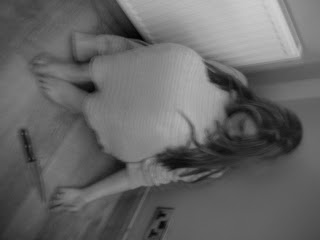
me sitting at the table refusing to eat, lable over mouth, used make-up to create bags under eyes, no make upp (pale) tied hair up to make my face appear slimmer, wore baggy jumper to make me look thinner. boring plain boyish colours blue dark represnting state of mind/thoughts, . cooked dinner infront of me.
-high angle shot looking down on me showing shes alone and weak and has low self-esteem vunreable
-horrow from different angle, because its an uncrontable mental illness that (percentage use facts) of young girls suffer from. disturbing facts
- althought not obviously associated with horror in the same way blood knifes and death are, it still conveys horror and has an eeire feels to it. teary eyes make u feel sympathy and want to help. could be used to persuade people to donate to charitys who specialise in helping with these types of problems?

------------------

was going to use pic of girl running in woods, obv running from something put yourself in characters shoes and are frightened for her , whats she looking at? searching for a way out? didnt use because too simple, not a lot of thought behind it.

-----------

slit wrists - sucicidle - being abused? - raggy clothes, dirty hair. hiding, why? what she done?

Monday, 1 November 2010

Planning - Drawing of horror still


We were asked to design a horror still for practice with creating the correct mise-en-scene as well as using the cameras. Above are the sketches I produced, portraying the ideas I had.

Sunday, 31 October 2010

Low Angle Shot


This is an example of a shot from a camera positioned low on the vertical axis. This consists of anywhere below the eyeline, looking up. Like Worm's Eye View, this shot is popular in being used for the 'big, strong and superior' effect.

Worm's Eye View


This is a shot from below the subject, usually used to make a character or object seem superior, powerful or strong, and anyone else small and not important, clearly thats not the case in this example... However the young girl in this clip appears to have control over the situation and is almost the decision maker of what happens next.

Aerial Shot


Aerial shots are easily recognised as they are the only type of camera movement that is taken from a plane or helicopter for extreme height and establishment of a landscape making any characters seem insignificant. However it is a variation of a crane shot.

Reverse Tracking Shot


Also known as Dolly Zoom, this shot is a special effect that is used to unsettle its audience. The camera moves away from the object but zooms in at the same time, making the background appear to be changing size while the object remains the same.

Whip Pan


A Whip Pan is a type of Panning Shot in which the camera moves from side to side however is done to fast it blurs. This type of shot is commonly used as a transition between shots or even scenes.

Tracking Shot


The camera itself moves forwards or backwards, in or away from the subject. The shot is called a Tracking Shot because the camera is often run along a small track. In this particular example, the effect the use of camera movement has on the audience is to feel connected to the woman being watched and followed.

Wide Panning Shot


This example of a Panning Shot shows the horizontal pivoting or rotation of the Camera from one side to the other to show a larger area of the subject, in this case, the beach. The camera does not move apart from left to right, and often remains very still as the camera is on a tripod, however hand held panning shots are also used. The panning technique is used to suggest fast motion, and bring out the subject from other elements in the frame, as well as showing the surroundings or background.

Monday, 25 October 2010

Representations work - Secret and Lies

The clip opens with an establishing shot of “Maurice Purley Photography” (shop) with cars passing by, accompanied by music. The cars look old fashioned and dated which could represent the time in which it was set. Following this, is a medium long shot of a family of 4 including the grandmother, father, mother and son. Who we presume is the photographer, judging by his actions, appears in the shot for 14 seconds and then exits the frame however we can still hear his voice (off-screen diegetic sound). The costuming of the family suits both their age and gender, for example, the teenage boy is wearing a casual t-shirt and navy blue bottoms. In the background, there are no props apart from the newspaper which leaves with the photographer. There is also no scenery, just a backdrop for the photo which is made up of dark colours, smudged together to give a cloudy, muffled effect. The mother is in the centre of the frame, and appears to be the most important character. Body language of the father and son suggests he does not want to be there. Facial expressions of the mother and grandmother on the other hand shows they have probably organised/ planned the family photo. The lighting in this shot is low key, as the flash of the camera supplies the light. The sound is diegetic for the duration of the clip. Accents portray the family’s ethnic background (being British).    

In this clip there is only one individual however you can here the photographer. Judging by his costume (or lack of it), we presume he is a boxer. As far as make-up is concerned, it appears he has some means of this on his face and body to make him look wet and shiny as a boxer would be during or shortly after a fight. The body language almost contradicts itself as he is laughing with the photographer yet posing in a way to seem aggressive and strong, this is also shown through his facial expressions. The lighting in the clip reflects off his body adding to his ‘sweaty and toned’ appearance. The colours of the mans shorts and gloves, red, black and white, could be seen to represent the colours of the English flag as well as symbolising competitiveness. This clip shows a typical stereotype of someone involved in sport.    

The clip opens with the photographer questioning and conversing with the lady in the shot. She is dressed as a nurse in a blue and white dress with a white hat to match this. There is one prop present, an antique wooden chair. The women of orient decent, appears to be miserable, this is portrayed through her facial expressions as well as her body language seeming fake or put on. This is also stereotypical of working class people. The hair and make-up of the women is very minimal and ordinary. We assume from observing the mise-en-scene that she possibly represents a nurse during the Vietnam war which would explain her sad conveys.

 This clip is of a mother holding a fairly new born baby. The backdrop has now changed to a plain white screen and the mother is dressed in a simple white dress which creates a heaven like piece of imagery, the baby representing angelic innocence and purity as they are bare naked and celebrating the start of a new life and generation.

 
The final clip opens with five smartly dressed men, in suits and ties, representing their status, expertise and level of authority or importance. Four of the men are standing, while one man is sitting in a chair in the center of the frame. The slightly elder man who is seated is dressed in a three-piece suit, where as the others are wearing only suit jackets and trousers, this could suggest he is of a higher importance. The body language of the men makes them appear successful and professional this is because they are standing up straight which makes them look proud of what they have achieved as well as their happy facial expressions. The voice over is the photographer speaking and any other sound present is non-digetic. Again, the lighting is low key. The colour of the backdrop is dark, and the men’s suits are also dark which makes them blend in, however their white shirts and pale skin makes them stand out. The men in suits are stereotypical of working class English men, in the 1920’s.

Wednesday, 13 October 2010

Sherlock Holmes Film Review

Director: Guy Ritchie, previous director of Lock, Stock and Two Smoking Barrels (1998) and Snatch, which was released in 2000.
Release date: 25th December 2009 (US). Avatar (Box Office), Harry Potter and the Half-Blood Prince and Ice Age: Dawn of the Dinosaurs was also released in this year.
Writers: Michael Robert Johnson and Anthony Peckham
Studio:  Filmed in numerous places including; Freemasons’ Hall, St Paul’s Cathedral, Manchester’s Northern Quarter and Leavesden Studios.

                Just from looking at the DVD case of Sherlock Holmes, I almost immediately decided I wasn’t to like it. However, I was pleasantly surprised to find myself thoroughly enjoying it even after just the first couple of minutes. Although neither Action, Crime or Suspense, being the genres of the film, are of any particular interest to me; alongside the fascinating character Robert Downey Jr helps us, as an audience, to connect with so well; the mise-en-scene and general story line, together created a different, addictive mystery film which I am sure would appeal to a wide range of age groups.
                I specifically concentrated on the camera work and editing as asked, and noticed many examples of suspense and tension being created through this. For instance, all things associated with evil, death and all things negative, were used to enhance the audiences reaction and fear, such as dark, dim lighting accompanied by chilling music for the effect of eeriness. I also noticed how a black crow would appear, in close up, whenever the villain (Blackwood) was near or being spoken about, this relates to the idea of symbolism. I thought the way the main characters were introduced, established and developed was quite intelligent for illustration; the disorder and clutter of Holmes’ studio almost represented his thoughts.           
                The ending of the film half lead the audience to believe there would be a Sherlock Holmes 2, but not stating this, just leaving it open for personal interpretation.

Monday, 4 January 2010

Opening Sequence Analysis - 'Dawn of the Dead'


'When there's no more room in hell, the dead will walk the earth.'
Dawn of the Dead (2004)
Genres: Action, Drama, Horror, Thriller
Certificate: 18
Directors: Zack Snyder
Writers: George A. Romero, James Gunn
Cast: Sarah Polley, Ving Rhames, Mekhi Phifer
Production company: Strike entertainment
A nurse, a policeman, a young married couple, a salesman, and other survivors of a worldwide plague that is producing aggressive, flesh-eating zombies, take refuge in a mega Midwestern shopping mall.
SOURCE - IMDb

-----------
MY NOTES;
Ana, a young beautiful nurse finishes her day-shift at the hospital to return home to her beloved husband, they make love and sleep together. The next day, after her husband is killed by her neighbor next door, he suddenly comes back to life. She discovers the chaos happening in her neighborhood and escapes from her home. Soon after coming to her senses in the woods, she encounters a cop and other survivors, they decide to find safety in a mall. Soon more survivors come, and they learn that if they want to stay alive, they should stick together as the world is overrun by an army of undead. Can they survive the horror in this horrific global chaos? When there is no more room in hell, the dead will walk the earth

again gory, although our opening sequence does not portray any of this as far as the eye can see but if the film was to continue i imagine ther would be

------------

Opening Conventions
Narrative Function-
Characters/ Stars-

hook audience/enigma/action codes-
Film Lang- MES, Cinematography, ( light and colour)-  
Film Lang- Movement , Framing, Editing and sound-